Northern Pasta Co.
Pasta for
the people
The Challenge
Imy found spelt working in a Cumbrian bakery, spotted the gap on the supermarket shelf, and convinced Matt to join her. A market stall came first, then a feature on James Martin’s Saturday show, then their own factory.
By summer 2026 the brand had outgrown the site it was selling on. The identity had grown up in pieces, without a design system to hold it together, and every new asset meant another judgement call. Customers bought single bags rather than bundles, subscription sat behind a link off the product page rather than in the journey, and fewer than half came back for a second order.
None of that was a demand problem. The brand was winning awards, winning shelf space and winning customers. It was losing them at the point where the site was supposed to do the work. Tribe was brought in across three workstreams running in parallel from June 2026: a brand identity sprint, a full Shopify rebuild, and a retention programme in Klaviyo.
Brand evolution, not revolution
The sprint anchored on a single idea: creating a visual home for the love of pasta.
Colour was the open question. The brand had six pasta shapes, each with its own colour, and no rule for which led. The recommendation was to lead with cornflower blue, taken from the hero SKU, and let the other shape colours carry personality in support rather than compete for the top spot. One colour holds the brand. Five give it range.

A colour for every shape
Six shapes, six colours, and one rule for how they work together. Each shape carries its own colour through the site, so the identity does the navigating. Radiatori and Gigli look like different products before a word is read.
Product cards animate on hover to reveal the illustration sitting behind the pack, bringing the brand’s graphical touchpoints into the shopping experience rather than leaving them on the packaging.
Close-up sauce-stirring video runs through the product pages alongside reviews, recipe blocks and a sticky add to cart, so you can see the texture of a bronze cut, slow dried pasta before you buy it.
Build a Bundle
The new bundle builder asks for the purchase type first. Subscribe and save 10%, or order once with no commitment. Choose subscribe and a frequency appears, one, two or three months, with pause, skip and edit spelled out underneath. These decisions used to sit buried further down the journey. Bringing them forward takes friction out of the purchase.
Shapes are then mixed and matched with a running subtotal and subscription pricing shown live against the one-time price. A padlocked checkout button counts down to the two-bag minimum, so the requirement is clear from the start rather than at the end.
Extras sit in their own group and behave differently by design. The seasoning and the recipe book ship with the first order only and never recur, so a subscription cannot quietly turn into something the customer did not agree to.
Skio handles the interval rules and checkout consistency underneath all of it, without any of that complexity reaching the customer.
Restructured Recipes
The email work started with an audit, and the audit found more structural problems than creative ones. Repeated conditional splits doing work that profile-level filters do more reliably. Missing consent filters. A 30-day re-entry window on abandoned checkout, cut to 14, with smart sending switched off so a time-sensitive sequence stops being suppressed by an unrelated campaign.
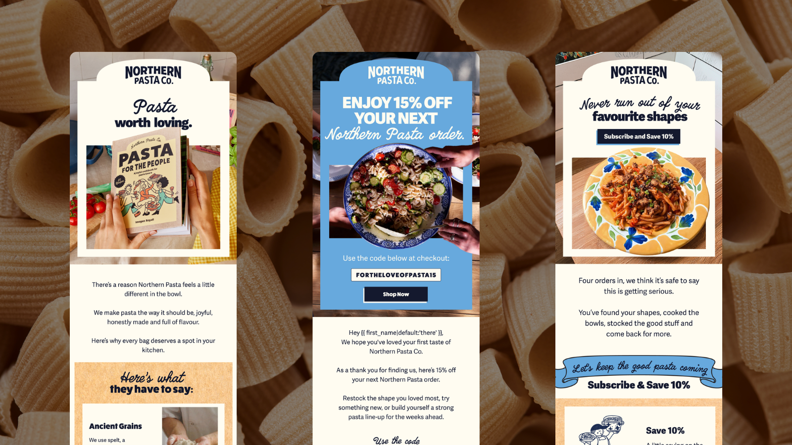
On top of the fixes sits a full lifecycle programme built in the new brand: welcome, pop-up, abandoned checkout, browse abandonment, replenishment, winback, VIP and sunset, plus a post-purchase sequence branched by order number. The same gingham, illustration and hand-drawn type running through the site carry into the inbox, so an email reads as Northern Pasta Co before the logo registers.
The post-purchase branching does the heavy lifting. Second purchase asks for a review. Third leads with a recipe and the cookbook. Fourth makes the subscription case, once a customer has proved the habit rather than while they are still deciding whether they like the product. Fifth moves to merchandise.
Retention Marketing
The email work started with an audit, and the audit found more structural problems than creative ones. Repeated conditional splits doing work that profile-level filters do more reliably. Missing consent filters. A 30-day re-entry window on abandoned checkout, cut to 14, with smart sending switched off so a time-sensitive sequence stops being suppressed by an unrelated campaign.
On top of the fixes sits a full lifecycle programme, designed and built in the new brand: welcome, pop-up, abandoned checkout, browse abandonment, replenishment, winback, VIP and sunset, plus a post-purchase sequence branched by order number.
That branching is the part that earns its keep. Second purchase asks for a review. Third leads with a recipe and the cookbook. Fourth makes the subscription case, at the point where a customer has proved the habit rather than while they are still deciding whether they like the product. Fifth moves to merchandise.